Business owners and entrepreneurs have a lot to prepare when presenting themselves and their venture to the world; there are press releases to write, pitches to perfect, and potential leads to chase.
Yet as technologies change and platforms evolve, it can be easy to overlook one of the most tried-and-tested publicity tools: a memorable business card.
Examples of a Good Business Card
To prove it, we've compiled seven brilliant real-life business cards from some of the most successful entrepreneurs in recent history, as well as highlighted some elements that you can incorporate into your own card.
Here are our favourite picks:
Evan Williams
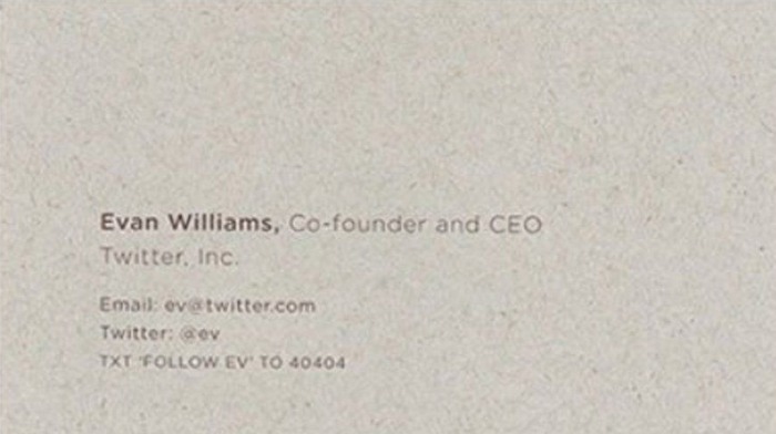
An influential internet entrepreneur who cofounded Twitter (and acted as its CEO for many years), Evan Williams' leadership took the company from a microblogging experiment to the third largest social network in the world – and one of the most iconic brands of the 21st century.
In this context, his business card lets his work speak for itself. The instantly recognisable Twitter logo sits alone on the front of the card, which is printed on textured recycled paper, helping remind the recipient of Twitter's corporate values. On the opposite side, Williams' name and titles are listed without distraction, as well as the numerous ways in which to get hold of him.
This business card exudes confidence and simplicity. It makes an impression while allowing for the owner’s accomplishments to speak for themselves.
Steve Jobs
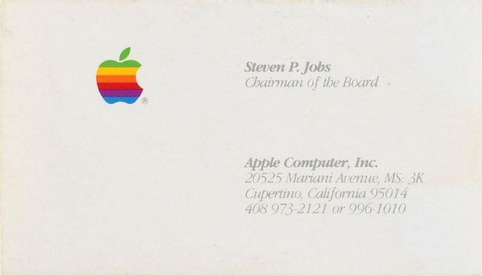
The mastermind behind the iPhone revolution built a career out of implementing stylish designs in simple packages, and Jobs' business card reflects this mantra. Apple's technology utilised this approach in everything from iMacs to iPads, as well as his iconic black turtleneck look.
This card takes that aesthetic and capitalises on the strength of its approach. A simple off-white background is barely disturbed by a grey italic font, where Jobs' name, title and contact information are condensed into the lower right-hand corner.
What really makes the card work, however, is the inclusion of the colourful, retro Apple logo. The bright colours make the card pop, even though they occupy even less space than they print. Much like Apple's famous packaging, this is a simple card with a powerful impact.
Jerry Yang
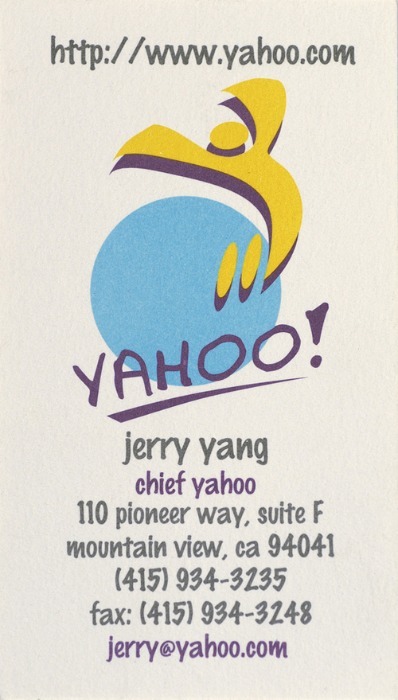
As the co-founder and CEO of Yahoo Inc, Jerry Yang had a pivotal impact on the growth of the technology industry during the early 2000s. His business card looks a little different to many of the others on this list, in that it is a lot busier – but then that is arguably the point.
Yahoo initially positioned itself as a fun brand that aimed to provide its users with as much information possible, and while Google's more restrained approach may have won out in the end, Yang's business card is designed in that same original spirit.
Do not be afraid of making a business card that reflects who you are and what your business represents. If you are the owner of a creative company, you can find ways that express this in your design. There is nothing wrong with bold uses of colour if the people you are giving it to will understand your intention.
John Rockefeller
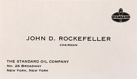
While there are a lot of creative things you can do to make your business card stand out, they still represent a traditional callback. That is why a card like John D Rockefeller's can still be used as a source of inspiration when designing your own.
Rockefeller was a titan of industry in the late 1800s and early 1900s; an almost mythical figure who inspired fear in his competitors. His card speaks to the no-nonsense nature of his business acumen, with his name front and centre in a bold font. It features basic contact information and the Standard Oil Company emblem on prominent display.
Recipients would have got what they needed from this card in a second – and would have been left with the impression of a man who knew his place at the front of the business world.
Mitchell Baker
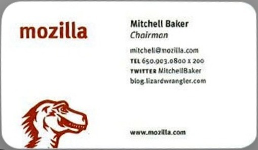
Somewhere in between the no-frills approach of Rockefeller's card and the slight artistic extravagance of Jerry Yang's sits Mitchell Baker. The executive chairperson of Mozilla (the company behind the once-dominant Firefox internet browser), her business card breaks with the expectations of other CEO business cards. It features soft, curved edges and an understated but relatively complex illustration of the dinosaur logo that was first used by the company.
This is a design that subverts many of our expectations, standing out from the norm while still satisfying our need for the necessary information. Her name, title, and contact information are easily found, while the card is different enough from most to live in the memory of its recipients.
Bill Gates
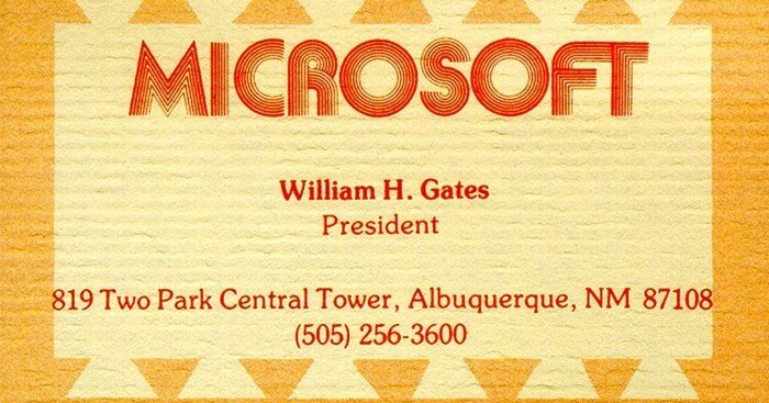
Microsoft's dominant position in the technology industry has kept it at the forefront of practical design since its inception, and its legendary founder Bill Gates has had several standout business cards designs over the years. However, few stand out as much as one of his first, a 1975 orange and red design declaring him the president of the Microsoft company.
By following the prevalent design trends of the 1970s, the card has not aged superbly, although there are some fun nostalgia factors present. However, a business card does not necessarily need to be timeless to be effective.
Do not be afraid to follow trends to make your business card stand out. It may help you get the attention your company deserves and establish a foothold with the people you are pursuing. In addition, if you are not happy with one design, you can always try a new one. A business card does not need to be as permanent as a logo, and you should feel free to change it as you and your company evolves.
Larry Page
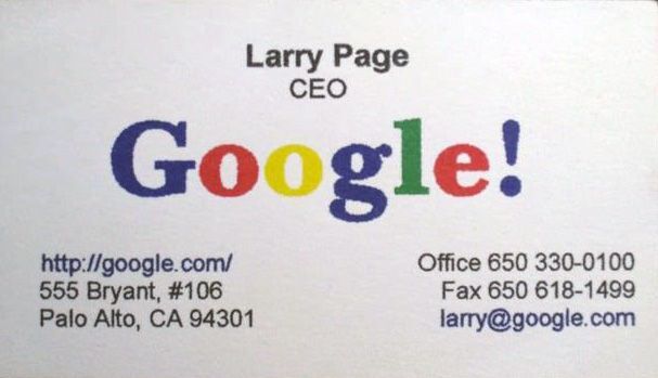
As the co-founder of Google (and former CEO of parent company, Alphabet), Larry Page's business card consists of a formal design that communicates simple information in a direct way.
While the man himself oversaw one of the most important business organisations on the planet, his card could not be more straightforward. His name and title sit above the iconic Google logo, with his contact information sitting directly below. The whole thing is laid over a simple white background that is deliberately reminiscent of the Google home page seen by millions every day.
---
If you are working on designing a new business card for yourself, take inspiration from the influential designs utilised by these CEOs and entrepreneurs. Once you have found a card that speaks to you, you can then draw inspiration from it in the design of your own card.
Was this article helpful? Let us know your thoughts - and your favourite business card examples - in the comment section below!
