Putting together a business website is a tough enough enterprise as it is, even before you consider how much of a punch and an impact it will have on your potential customers. Yet a well-designed and engaging URL can be well worth the endeavour, grabbing people's attention and showcasing all the positives of your brand.
In most cases, this means strong aesthetic design and an interactive interface but, more importantly, a practical user design with minimal bugs, thus allowing consumers to purchase your products or obtain information about your services as seamlessly and intuitively as possible.
So, how should your design look?
Examples of a Good Business Website
To provide you with some ideas of how to do this well, we've compiled a brief list of small business websites from across a variety of industries. Whether you're a small local restaurant or an innovative design agency, there are plenty of lessons to be learned here; these are seven of the best business sites on the world wide web:
Beauvoir Creative Agency
 Beauvoir Creative Agency
Website: https://beauvoir.ca/en/
Designed by: Self-built
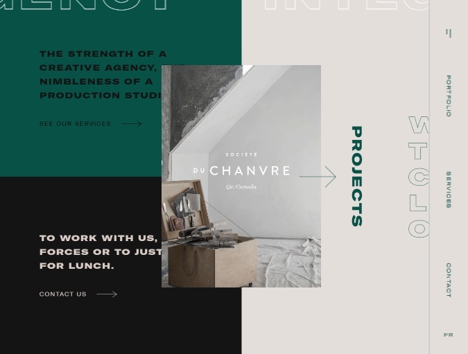
Based in Québec, Beauvoir Creative Agency is a marketing firm that understands the benefit of striking aesthetics. Like all good websites, it is designed with the user in mind; this means navigable sidebars, multi-directional scrolling, and even the ability for visitors to select their own colour scheme.
Crucially, the company's key selling points are easily found, too; you don't need to trawl through pages of content to establish what services the firm provides, while it is also a great example of how to use video effectively on your homepage. Some may find the array of colours and movement a little overwhelming, but it projects a clear sense of energy and dynamism that is reflective of Beauvoir's brand.
Crypton
 Crypton
Website: https://crypton.trading/
Designed by: Evrone
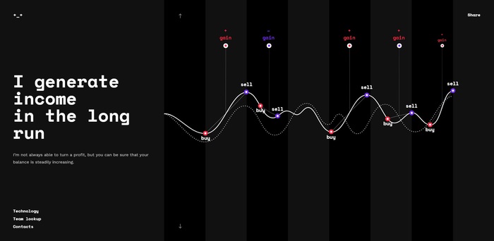
A small cryptocurrency trading startup based in San Francisco, Crypton cuts straight to the chase with potential customers, taking on the persona of its machine learning bot to explain clearly and confidently what it can do.
As a result, it gives off the effect of being immersed within a digital platform, with text and graphics revealed in response to your actions, such as scrolling the mouse. There is also minimal technical jargon involved, with the "bot" explaining in layman's terms what it is capable of and how it can benefit the user's needs.
Foosball World Cup
 Foosball World Cup
Website: https://www.foosballworldcup18.com/
Designed by: AQuest
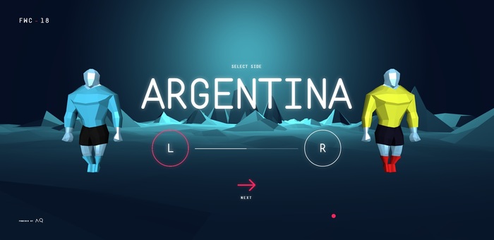
Created to celebrate the 2018 FIFA football World Cup – as well as the table-sized, rods-fixed version of it – the Foosball World Cup website is simply a video game that users can play easily. No information, no context, and no menu – simply the option to pick a team and have some fun.
Though the gameplay itself can be a little clunky and takes some getting used to, the music choice, colours, interaction capabilities and sheer entertainment factor make this an unforgettable online experience. In many cases, it is the perfect example of a website promoting the message of its brand; it's fun, it's engaging, and it doesn't take itself too seriously, just like foosball itself.
Genesis
 Genesis
Website: https://eatgenesis.com/
Designed by: Herdl
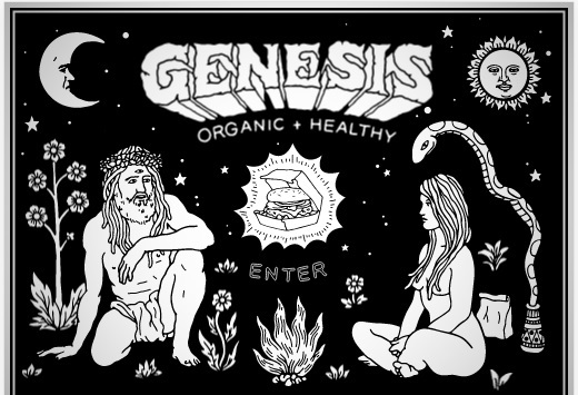
A vegan restaurant located in the heart of London's lively Shoreditch area, Genesis is another useful exercise in brand consistency.
The striking Garden of Eden-themed graphics are a nod not just to the company's name, but also the entirely plant-based nature of its menu, and are unveiled in a dramatic and engaging fashion. Remarkably, given the strong presence of so many moving parts, it is still highly user-friendly, too, with users first introduced to what kind of food the restaurant serves, before presenting the menu. More key information then follows, as well as an unobtrusive corner popup that teases the company's merchandise, cementing the page as a masterclass in modern user engagement and functionality.
In Pieces
 In Pieces
Website: http://www.species-in-pieces.com/
Designed by: Bryan James
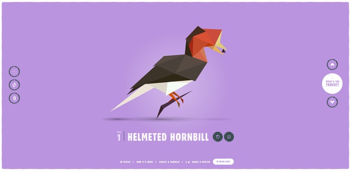
Presented as a virtual art exhibition, In Pieces is a personal project that aims to highlight the plights of 30 endangered animal species, such as the golden poison frog and the forest owlet.
Rather than using photography, each animal is constructed with 30 geometric pieces, and links to a wealth of information on the animal's habitat and level of extinction threat. It also contains links to videos that further explore the story of each species. Crucially, In Pieces also includes links to charitable organisations and societies that are aiming to halt and reverse these processes, making it a striking piece of activism that is attention-grabbing and aesthetically appealing – even if it does lose points for a lack of site security.
Mikiya Kobayashi
 Mikita Kobayashi
Website: https://www.mikiyakobayashi.com/
Designed by: Baqemono
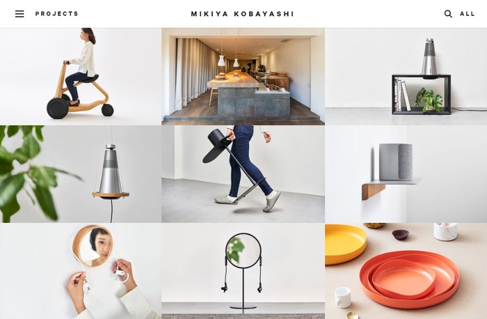
The online portfolio of Tokyo-based furniture designer Mikiya Kobayashi, users are greeted with a minimalist landing page that quickly transforms into a visually stimulating and colourful catalogue of projects.
This isn't just for organisational purposes, though. Much of Kobayashi's work is built around the concept of using space wisely and proportionately, and this design mantra is reflected in the layout of the website, very much a less-is-more approach where nothing is placed on the page unless it needs to be.
Indeed, this website is an excellent reference point for any creative or crafts-based entrepreneur, regardless of whether you are selling clothes, hand-made items, or anything else that combines style with functionality.
Bandito (Twenty One Pilots)
 Twenty One Pilots
Website: https://www.imabandi.to/
Designed by: Resn
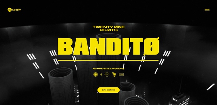
Most artists possess an online domain to deliver news and information on tours, album releases and merchandise, but the creation of an entire website dedicated to a single song is a unique concept.
A self-proclaimed immersive audio experience, the site is essentially a promotional tool for the US pop group Twenty One Pilots and, in particular, their single Bandito. Taking the form of a first-person video game, the site invites users to locate clues that tie in with the artwork used on the band's album, Trench (from which Bandito is taken); while all of this is going on, the song itself plays.
With links to purchase physical and digital versions of the track, the website presents a number of potential ideas for business owners who are looking to promote individual products rather than an entire stock, with the concept sure to capture consumer imagination and create buzz regardless of what you are selling.
---
Given the technical complexity and ambition of many of these websites, hiring a professional design company is advisable. However, you don't need to spend large sums of your marketing budget to be innovative. Focus instead on how you can stand out from the crowd and provide your potential customers with an exceptional online experience, and engagement and success will undoubtedly follow.
In the meantime, what other business website examples would you recommend as inspiration? Let us know your thoughts in the comments section below.
Additional content provided by Sion Phillpott.
