From the most famous logos in the world — think Nike's signature swoosh or McDonald's golden arches — to the lesser-known designs of smaller companies, a logo is made to make an impact on its viewers.
Therefore, when creating your own, it can help to find some inspiration, as well as get to the heart of what makes the world's best logos so effective.
Examples of Great Logos
To do so, we've rounded up examples from around the globe, from the immediately iconic to the criminally underrated. Here are 12 of the best company logos:
Apple
Known for its iconic leadership, enormous brand value and ruthlessly effective business strategy, Apple's minimalistic aesthetic aligns perfectly with its logo. The apple itself is not just a visual cue, however; speculation surrounding the symbolism of the single bite references several sources, from computer pioneer Alan Turing (whose body was found next to a half-eaten apple) to the biblical imagery of Adam condemning humanity in the Garden of Eden. Others yet suggest it is a nod to Sir Isaac Newton.
Unfortunately, the truth is less intriguing. According to its designer, Rob Janoff, the bite is simply for scale, so that it looks like an apple and not a cherry; nevertheless, it remains one of the all-time great logos, iconic, intriguing and relevant.
Chanel S.A.
Founded 110 years ago as "House of Chanel," this luxury haute couture label was spearheaded by its stylish couturière and namesake, Gabrielle "Coco" Chanel. The overlapping "Cs" of her name, displayed back-to-back, represent one of the best-branded logos in fashion and has been identifiable since its inception in 1925.
Since then, it has transcended the brand, evolving into the iconic symbol of wealth, elitism, and elegance that her clothing, accessories, perfumes, and make-up are most famous for.
Cooley LLP
With offices across multiple continents, Cooley LLP is a global law firm that stands out from the crowd - both in terms of their service provided and their carefully defined branding.
Deciding to animate their logo on their website is a novel twist on a regular, stagnant design, giving off the impression of a firm that is innovative and modern. These are two characteristics that clients want in a lawyer, and is a bold step in the corporate world, where doing things by the book is not always the way to move forward.
The Guild of Food Writers
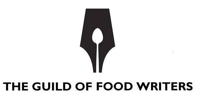
A clever amalgamation of the two worlds that this company transcends, the Guild of Food Writers' logo consists of a spoon nestled within the nib of a fountain pen. A nod to both the culinary world and the fundamental tool used by every writer for centuries, their logo lets viewers know what they are about, without leaving any room for confusion.
Hyundai
When first looking at this highly recognisable logo fastened to the exterior of every Hyundai vehicle, the "H" seems obvious: after all, the name of this famous manufacturer begins with the same letter.
Although this is true, the significance is actually more profound, though. The two vertical lines of the "H" symbolise two people, while the horizontal line connecting them represent a handshake, reflecting the level of trust and satisfaction that they strive for with their customers.
LG
Like Hyundai, LG is, on the surface, a nod to the company's name; the initials stand for Lucky Goldstar, the electronics giant's former title.
However, there is, again, more than meets the eye here. The combinations of the letters "L" and "G" create a human face, with the former acting as the nose and the latter as the shape of the head and right eye (making it appear as if it is winking). As LG themselves state, in combination with this seemingly kind face, the red colour of their logo "represents [their] friendliness, and also gives a strong impression of LG's commitment to deliver the best."
McDonald's
The world's most famous fast-food franchise, McDonald's is best known globally for three things: their hamburgers, their French fries, and their Golden Arches. No matter where you are in the world, the chain's famous logo catches famished locals and travellers alike, standing out from the crowd like a giant beacon.
The logo's combination of two colours, yellow and red, are well selected, too; the yellow represents energy, attention, and cheerfulness, while the red elicits a sense of hunger in those who look at it.
Michelin
Thanks to the widely recognisable Bibendum (more commonly known as the Michelin Man), tyre giant Michelin possesses one of the most iconic logos of all time, as well as one of the oldest trademarks in the world.
As with all great logos, it has even made an impact on popular culture; Bibendum has appeared in a host of media productions, from William Gibson's 1925 novel Pattern Recognition to the popular cartoon satire Family Guy.
Ryanair
This Irish low-cost airline opted to utilise the national symbol of its country of origin as its logo: a yellow harp against a blue backdrop.
Though it began as a regional carrier within Ireland, the airline expanded to offer flights across the entire continent of Europe, yet even with this shift in services, Ryanair is a good logo example of a company that has stayed true to its heritage. Just as the golden harp has withstood the tests of time as the symbol of Ireland, so too has it endured as Ryanair's logo today.
Le Tour de France
An annual men's multi-week bicycle race, the Tour de France logo ingeniously incorporates a cyclist within the letters "our," in the race's name. Designed in 2002 by Joel Guenoun, the creation is an obvious nod toward the entire purpose of the event. It was introduced the following year for the one-hundredth anniversary of the Tour and, with such clever marketing embedded within the logo itself, it's no wonder that this top logo has remained unchanged.
Unilever
Although at first glance, this logo may seem a tad chaotic, upon closer inspection, you will see exactly why it is such a high-quality design; because the company, Unilever, is focused around bringing vitality to your everyday life, the twenty-four elements within the U-shaped logo reflect all the avenues through which this is achieved. This includes a shirt (clothing), a spoon (food), and a bird (nature), to name just a few.
The Walt Disney Company
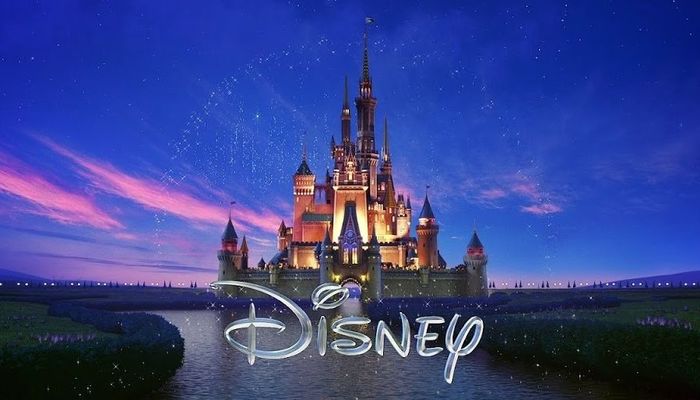
As viewers, we know what to expect prior to the commencement of a Disney film: along with the whimsical music, Cinderella's castle rising atop the famously loopy font of the word "Disney."
Even with its slight change in appearance over time — from the original white cartoon castle made up of thick horizontal bands in the mid-1990s, to the hyper-realistic computer-animated castle standing over a sparkling lake that we see today — this remains one of the most iconic logos of all time. When we see it on our screens, we instantly associate with feelings of nostalgia, fantasy and romance, as well as anticipation of what we are about to witness.
---
Whether you are seeking to start a small business or are a larger corporation looking to rebrand yourself, taking inspiration from the best company logos in the world is never a bad idea. By gaining a better understanding of what makes a good logo, you have a better chance of creating a unique design that stands out to your target audience. After all, the largest businesses of all time had to start somewhere, and typically, the best brand logos are not devised overnight.
If you require assistance in registering your trademark, then Starting Business can provide expert guidance. Why not arrange a consultation with one of our knowledgeable professionals?
What is your favourite company logo, and why is it so effective? Let us know in the comment section below

