Whether you are an aspiring entrepreneur, an established business owner, or anything in between, creating a brand identity for your new or existing business is one of the most critical steps in your overall brand strategy.
Brand identity constitutes the visible elements of your brand, such as the colours and designs that you use to portray the meaning of the company, the shapes and typography used within your logo, and the way that you present your products (such as packaging and store set-up) to your customers. In a similar vein to your vision and mission statements, your corporate identity is reflective not just of the quality of your services and products, but also of who you are and what you stand for as a business.
Examples of Brand Identity
To illustrate how significant your corporate image is, we've compiled a handful of the best brand identies to help you understand how to stand out from the crowd.
Apple
 Savvapanf Photo © - stock.adobe.com
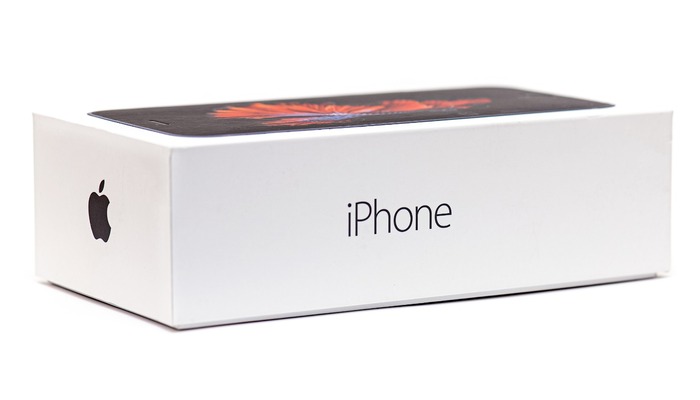
Apple's corporate identity is iconic across the globe and is an intrinsic part of their overall business strategy.
Colours: Black, white, and grey.
Logo: The Apple logo draws on the three colours that the company is best known for: white, black, and grey. The famous bitten apple always appears as a solid colour - either white on a black background, or as black or grey with a white background. When starting up the system of any of their devices, loading screens will always feature a white version of the Apple logo atop a loading progress bar of the same colour. As is apparent, everything ties together to mirror their corporate image.
Design: Ensuring consistency in their use of these three colours, any product that Apple creates will use a combination of these shades within their packaging. The sleek and simple boxes in which customers purchase their products are a stark white, featuring black writing and a high-resolution photo of the product encased within the box. In the situation where the most common product colour is purchased — 'space grey' — the third colour in the trifecta is thus present.
Apple also utilises the 'San Francisco' typeface throughout its iOS programmes (primarily due to its impeccable legibility), as well as on its packaging, manuals and any other brand materials, ensuring consistency throughout.
Coca-Cola
 pixarno - stock.adobe.com
Established in May of 1886, Coca-Cola has evolved into a household name over the last 133 years, making it one of the best brand identity examples.
Colours: Coke Red, black, and white.
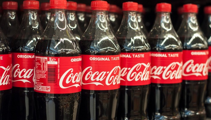
Logo: Coca-Cola's logo encompasses everything about its brand image, to the point where it is almost as iconic as the product itself. It offers a reassuringly familiar and nostalgic appearance, with the company well aware of its power. Therefore, it is unlikely to change or alter any time soon.
Design: A form of Spencerian script, Coca-Cola's typography goes back over a century. It has been present since the company's inception and is used on the packaging of the modern-day Coca-Cola Classic product as a white script on a Coke Red background. Indeed, during its market war with Pepsi in the 1980s, this return to tried-and-tested branding is credited with reviving the company's fortunes. As a result, this design is now seen on all the company's beverages, be they can or bottle.
The colour scheme changes only slightly for varying drinks and flavours, such as the Coke red script on a black background for Coca-Cola Zero's packaging.
 Oleksandr - stock.adobe.com
Despite the growing scrutiny of its business practices in the big data age, Google's corporate identity has long been a core part of modern society, synonymous with the primary product that it provides.
Colours: Blue, red, yellow, and green.
Logo: When you perform a web search on Google, you will find the search engine's name at the centre of the page, using a combination of blue, red, yellow, and green letters, on a stark white background. Its name (and logo) is written in Product Sans - a font very similar to that of Futura (released for public use in their 2015 rebranding). Though only slightly different from its mother font, Product Sans has been tweaked just enough to be unique and to powerfully reflect Google's corporate identity.
Design: When purchasing a Google Pixel smartphone, you will find that it comes in a sleek box with minimal colours; aside from the photo of the phone itself on the front of the box, the only colours you will see on the face of the package is a single Product Sans 'G', which features all four of the brand colours on the one letter: blue, red, yellow, and green. This is a knowing and subtle nod to a brand that everybody knows, cementing it as one of the most widely recognisable icons in the world.
Nike
 Олександр Луценко - stock.adobe.com
From the company name to how they present their brand image, Nike is a perfect example of one of the best brand identities of the twentieth and twenty-first centuries.
Colour: Black, white, and Nike orange.
Logo: Another brand that understands the meaning of 'less is more', Nike keeps it simple, using just black and white for its well-known 'Swoosh' logo. When featured on its products, the logo typically appears on either a solid white or black colour, depending on the colour of the material that it is printed on. One thing consumers can count on is that the logo on all Nike products is made to stand out.
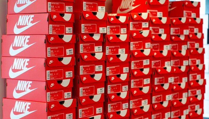
Although Nike orange was previously used as their logo colour, today, it is used as the shade of choice for their shoeboxes.
Design: Though heavily leaning toward the use of the font Futura Condensed Extra Black, what makes Nike stand out is the repeated use of its 'Swoosh' logo in combination with its "Just do it" slogan. Indeed, recent advertising campaigns have incorporated the use of just their two primary colours, with black and white images being selected for print and online image ads, accompanied by white text above their logo and slogan. The inspirational words spoken by various athletes on these adverts resonated with and drew in consumers on a global scale, making the campaign a huge success.
---
If there is one thing that these four companies all have in common, it is their expert crafting of a corporate image. However, through devising a solid brand strategy for your business, you too will be able to present your company as powerfully as the marketing teams in these examples have.
In the meantime, don't forget to take a look at our breakdown of the best product packaging examples on the market!
What other brand identities inspire you? Let us know in the comments below.
