Rebranding your company is rarely an easy endeavour. Indeed, when you consider the many corporate rebranding exercises that have fallen short over the last few decades, such as British Petroleum, GAP and the Royal Mail, changing things up might seem like an expensive risk not worth taking.
However, conventional marketing wisdom dictates that all companies should try something new after seven years, meaning that – at some point – you're going to have to reimagine your business.
Examples of Rebranding
In such instances, it can often help to look to others for inspiration. Therefore, we've put together a list of some of the most successful company rebrandings, as well as considered some of the most basic mistakes you should avoid along the way.
Here are some of the best case studies for rebranding:
1. Airbnb
Choosing to utilise the expertise of a third-party marketing company, DesignStudio, for their corporate rebrand, Airbnb unveiled their new image to the public in July 2014. It subsequently generated sufficient buzz, particularly on social media, where their creative proposition (and mission statement) of "belong[ing] anywhere" became evident on a global scale. Indeed, the company's name trended on Twitter for eight hours, thanks to the worldwide conversation that this successful rebrand example incited.
The company's decision to hire an external company was an important one, allowing them to gain a fresh perspective on their own mission and vision. It's proved successful, too, with the accommodation platform reaching a market value of over $1bn in 2019.
2. Flair Airlines
Based out of Kelowna in the Canadian province of British Columbia, Flair Airlines is a discount carrier making internal and cross-border flights with the US. Since their 2005 launch, Flair has seen three different logos, with the most recent reflecting their entire rebranding efforts. Unveiled on Instagram in February 2018, it was accompanied with the humourous caption: "Guess who just got good looking! Our style has changed, but our prices are still as low as ever."
In addition to their new image, Flair Airlines frequently and proudly shares the photos of their employees, allowing existing and future travellers of their airline to get a better feel for the flying experience as a whole. It is, therefore, no surprise that an essential part of their corporate rebranding has involved hiring employees that align with their vision for the company's future.
3. Keds
A popular shoe brand since 1916, Keds is a company that has established what they want from the future, while remaining aware of their past. From their original 'Champion' shoe design — the first mass-marketed canvas-top trainer — to their vast array of modern-day styles, the company is a perfect example of a traditional name that has used rebranding to re-invent itself for modern audiences.
4. Mastercard
With a continuing need for personal (and business) credit cards, Mastercard has long established itself as a household name. Since 1968, the company (then called "Master Charge: The Interbank Card") has featured a logo of two intersecting circles: one red and one a shade of yellow-orange. Because this is one of the most well-known logos in the world, it enables the company to capitalise on recognisability whenever they rebrand.
In their latest guise, for instance, the colours themselves are the same, but the colour shades have been carefully adjusted for them to appear "bright and glowing" against different solid coloured backgrounds. The company name has been removed, too, signifying confidence in the uniqueness of their brand visuals.
According to Mastercard's design studio, Pentagram, the new design also places increased emphasis on the famous interlocking circles, symbolising their use "in digital contexts" - a striking metaphor in an increasingly digitalised industry.
5. McDonald's
One of the world's most iconic brands, McDonald's is known globally for its golden arches and bold colour patterns. However, although founded in 1940, the establishment of the famous logo we see today did not make its first appearance until 1962. The latest incarnation features a combination of just two colours: yellow to represent energy, attention, and cheerfulness, and red to elicit a sense of hunger in those who look at it.
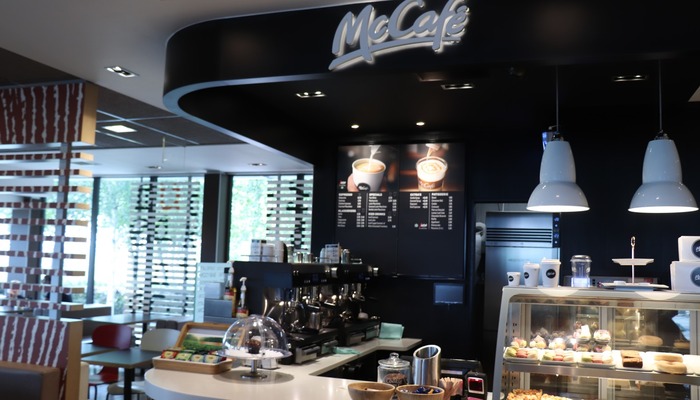
It's within its restaurants that the restaurant chain has truly rebranded, however. In recent years, the company has sought to evolve and diversify, opening a series of coffee shops known as 'McCafé' in 1993. This has been followed by interior design renovations at all McDonald's locations, where the company have attempted to adhere to the contemporary visual standards set by its corporate head office.
Gone are the wide booths and basic interiors of old, with most restaurants now featuring more neutral and sophisticated designs; in some locations, you can even sit next to a fireplace, for instance. The addition of self-order kiosks - particularly in busy stores - has also seen the fast-food giants taking the market lead in terms of customer-focused technology.
6. Netflix
From its 1997 launch to the present day, much of Netflix's business strategy has included significant rebranding. As the company's business model has evolved, so too has their marketing, with the basic and impactful red logo that we know today the latest incarnation of the company's oft-changed logo.
Netflix's rebranding is about more than just inverting colour schemes, though; the company has modernised its brand even further by adopting a light-hearted and even comic social media presence. This is relatable to populations across the globe, with both current and potential customers engaged with the company's sense of self-awareness.
6. Old Spice
Originally introduced to the market in 1937, Old Spice has been a popular purveyor of male grooming products for many years. However, with more modern brands competing for the business of the younger generation, Old Spice quickly recognised that they would have to engage in a successful corporate rebranding to remain relevant and desirable for new audiences.
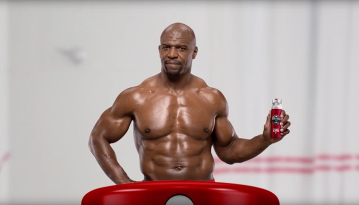
 Old SpiceActor Terry Crews in a recent Old Spice television advertisement
Today, nearly everyone with a television (or access to the internet) has seen Old Spice's 2010 'Swagger' campaign. This humorous scene-shifting advertisement is not only directed at the men who will be using the product, but also their partners. Upon discovering that 60% of men's body wash purchases are actually made by women (proof of the importance of market research, if ever it was needed), the company's marketing team decided to target both genders. Asserting that the ad's narrator is "the man your man could smell like", the campaign was a huge viral success, with the company's sales more than doubling and website traffic increasing three-fold.
---
Whether your company is trying to reach a new audience, reinvigorate your social media marketing, or adopt an entirely new logo design, the above examples are an excellent place to learn lessons and seek inspiration for your own company's rebranding.
What other corporate rebrands have been successful, and what can be learned from them? Let us know your thoughts in the comment section below.
